Monitoring
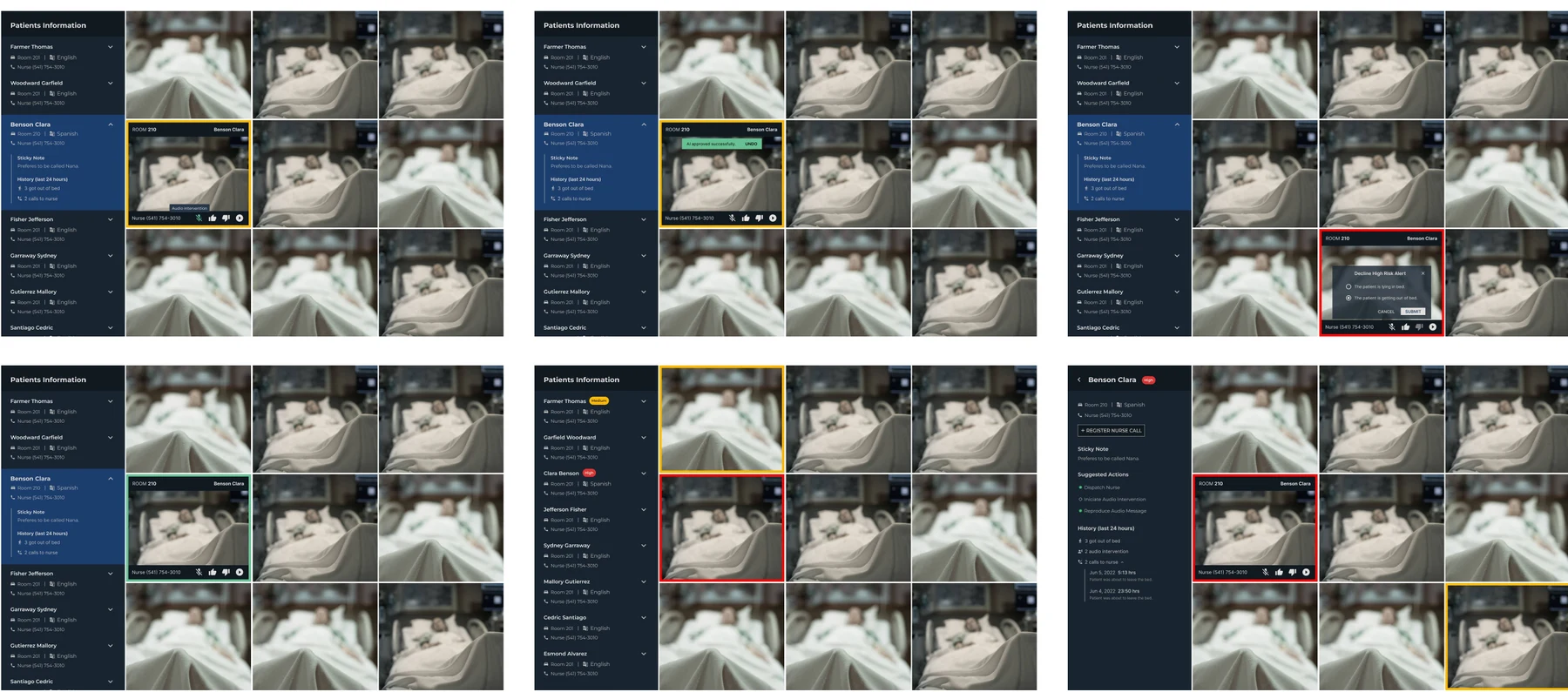
No-risk feeds remained unhighlighted to reduce distraction.
Featured case study · AI-assisted healthcare
Sentinel E-Sitter helped remote patient observers monitor several rooms, assess fall-risk alerts, intervene with patients, and coordinate an in-room response.
The challenge
One trained e-sitter could monitor up to nine patient rooms during the pilot. Several patients could trigger alerts at the same time, so the interface needed to make risk visible without turning every feed into competing noise.
The AI could detect sitting up as medium risk and leaving the bed as high risk. It did not replace judgment: the e-sitter still needed to validate the alert, begin an intervention, contact a nurse, and document the event through resolution.
Core workflow
AI identifies medium- or high-risk behavior across live feeds.
The e-sitter confirms or rejects the alert and starts intervention.
The observer documents the call and a nurse-response timer begins.
A visible status lets the observer confirm arrival and close the event.
Attention hierarchy
No-risk feeds remained unhighlighted to reduce distraction.
Yellow identified a patient sitting up and requiring attention.
Red and an audible alert signaled a patient leaving the bed.
Human control
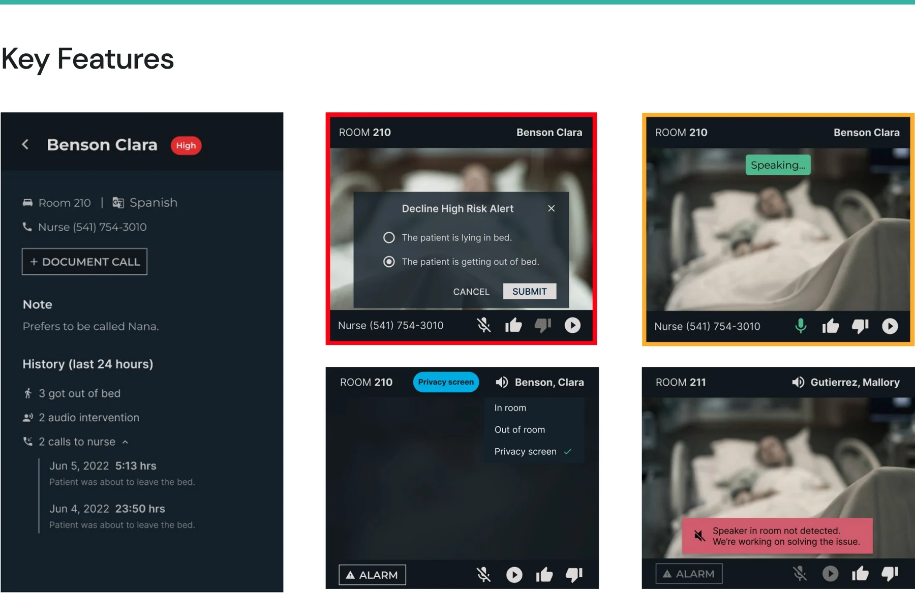
Thumbs-up and thumbs-down controls allowed e-sitters to validate AI output. Rejecting an incorrect alert produced an immediate confirmation, and the feedback contributed to improving future detection.
For high-risk events, the system could suggest a nurse from its database while preserving the flexibility to add someone manually. A status pill over the patient feed let the e-sitter confirm that the nurse had arrived.
Testing and iteration
Unclear icon affordances gained explanatory labels on hover.
Inputs were revised to make missing information more accessible and visible.
A coordinated badge and sidebar countdown made the time-sensitive state clear.
An onboarding guide explained how validation controls helped train the system.
The action became more prominent and easier to find in the required flow.
Approximately eight participants evaluated Figma prototypes and the workflow.
Reflection
Automatic movement of urgent rooms into a prioritized position was identified as a valuable next step, but it was not implemented before budget constraints ended the contractor engagement. I would also explore giving trained users clearer context for why an alert fired—without adding noise or implying certainty the model could not support.
Next